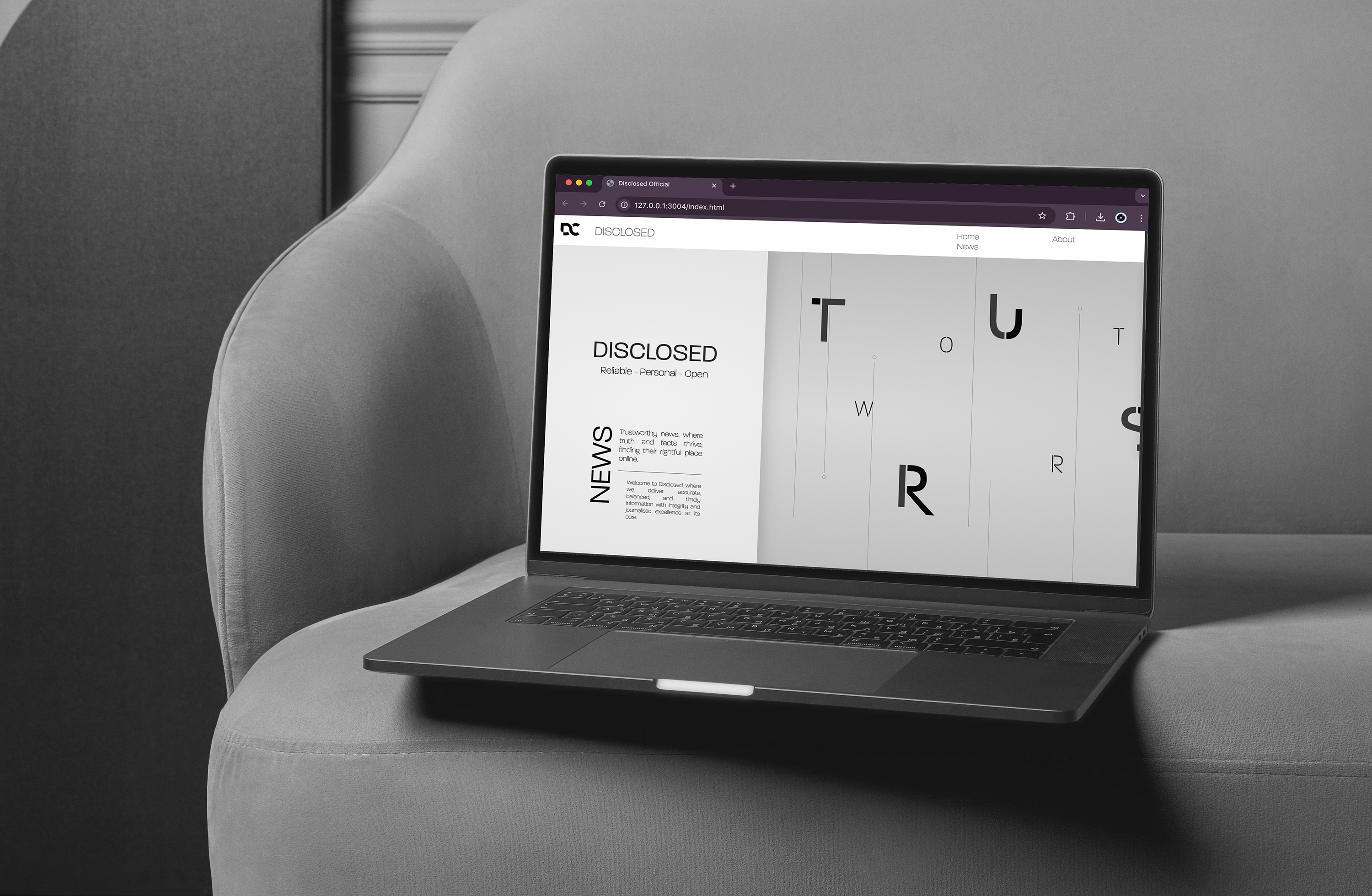
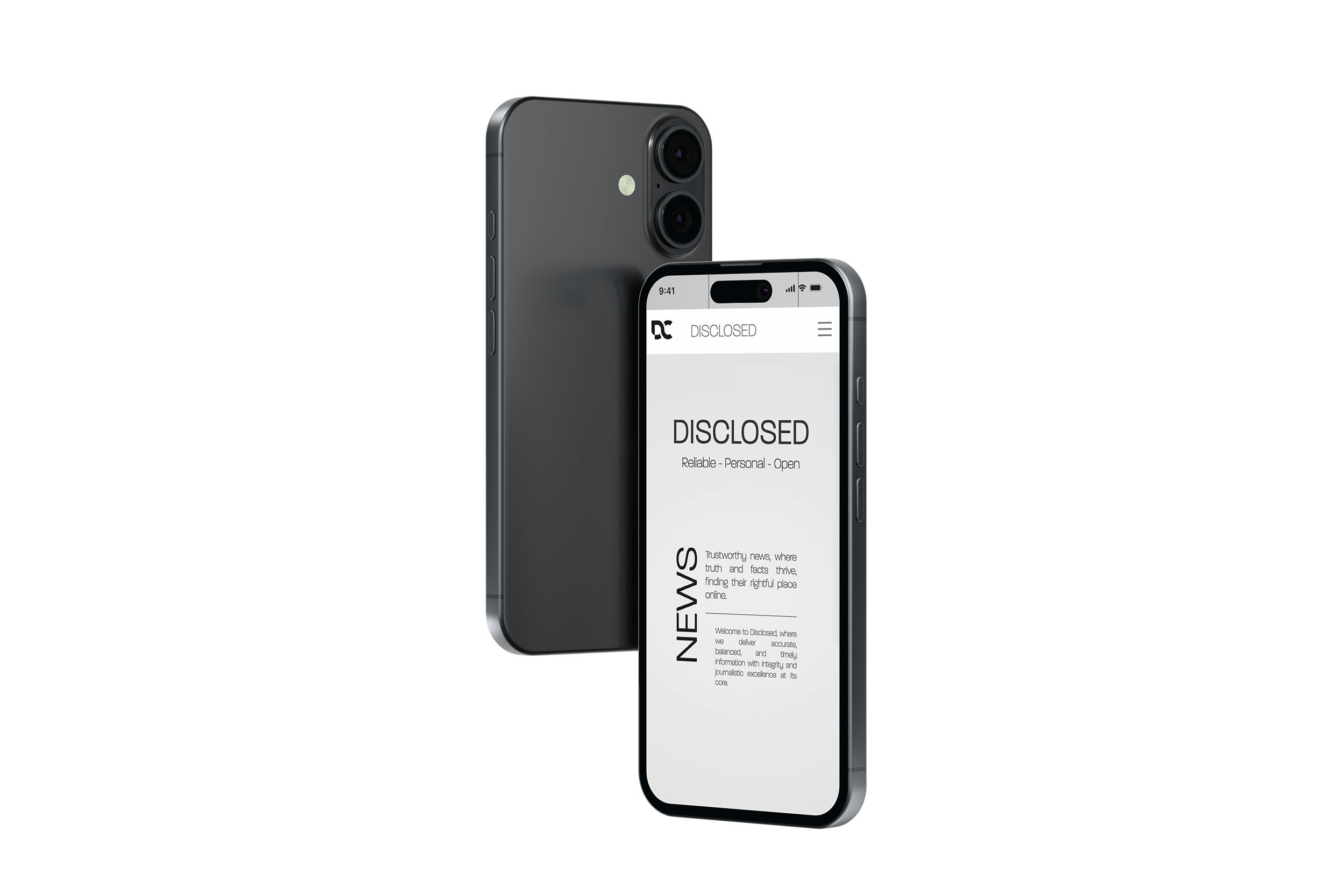
Disclosed was a year two design project that served as both a visual design challenge and an introduction to basic web development. As someone still new to coding, the project provided an exciting opportunity to expand my skill set and explore a different side of the design process. The brief asked us to conceptualize and create a digital news platform aimed specifically at younger audiences.
Using Visual Studio Code, we were tasked with building either a website or an app that combined engaging visuals with functional user experience.
Info
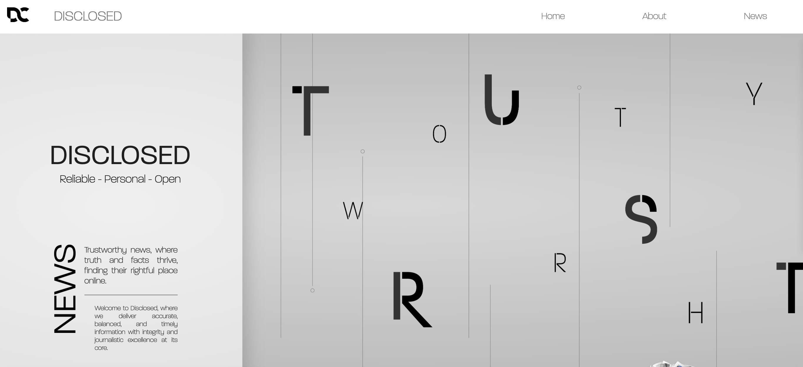
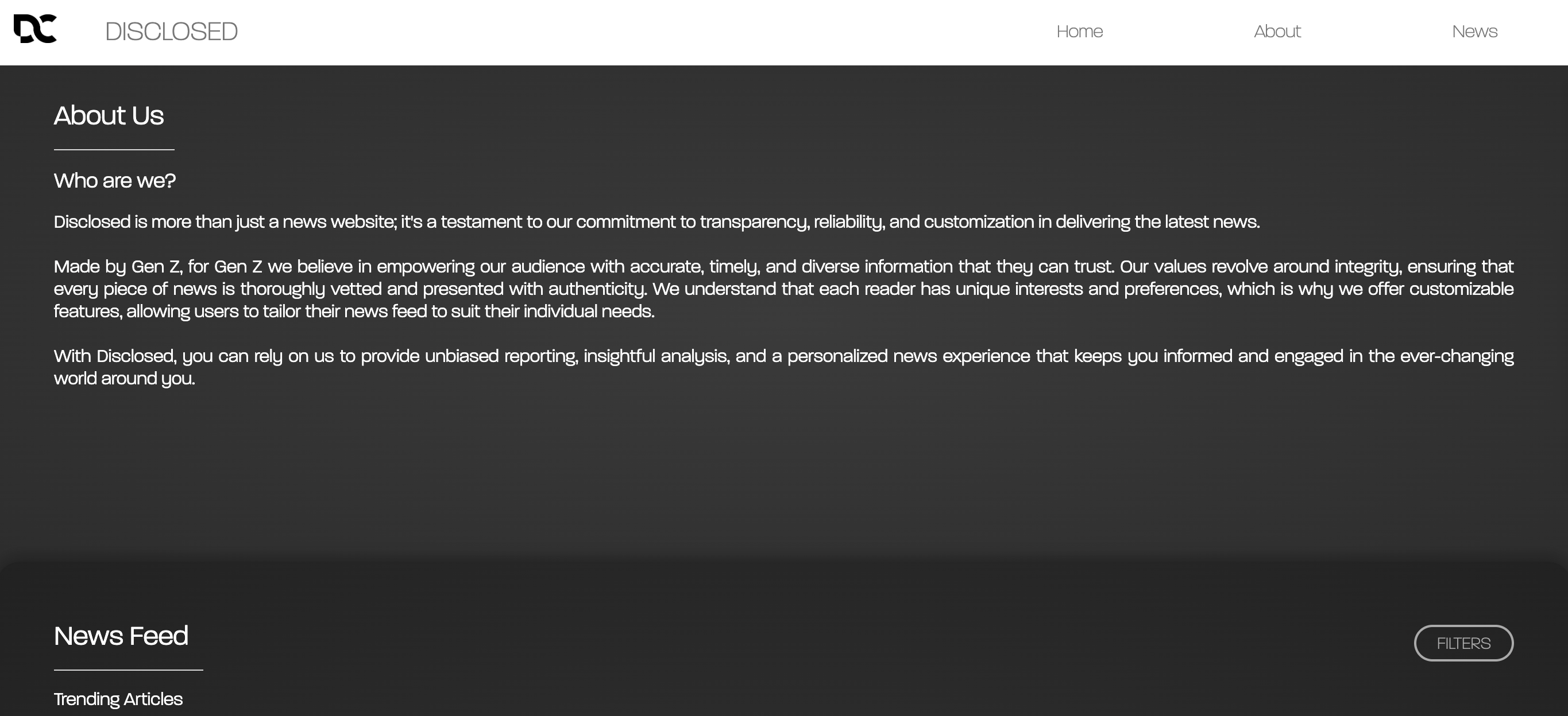
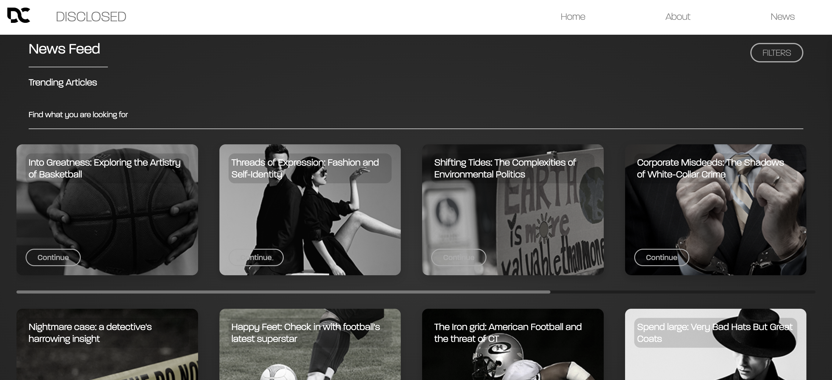
While I probably should have started by figuring out the core functionality of the news platform, the first thing I really dove into was the branding. I enjoyed exploring a range of visual styles for inspiration and began building moodboards to shape the overall direction. From there, I developed a brand identity based on a monotone colour palette and the use of thin accent lines, which helped create a slightly abstract, modern aesthetic.
The next step was naming the platform. I focused on words related to the spread of information, truth telling, and bringing things to light. This part was unexpectedly challenging I went through a lot of options that didn’t quite feel right. Eventually, I landed on the word Disclosed. Both its meaning and sound aligned perfectly with the concept I was building.
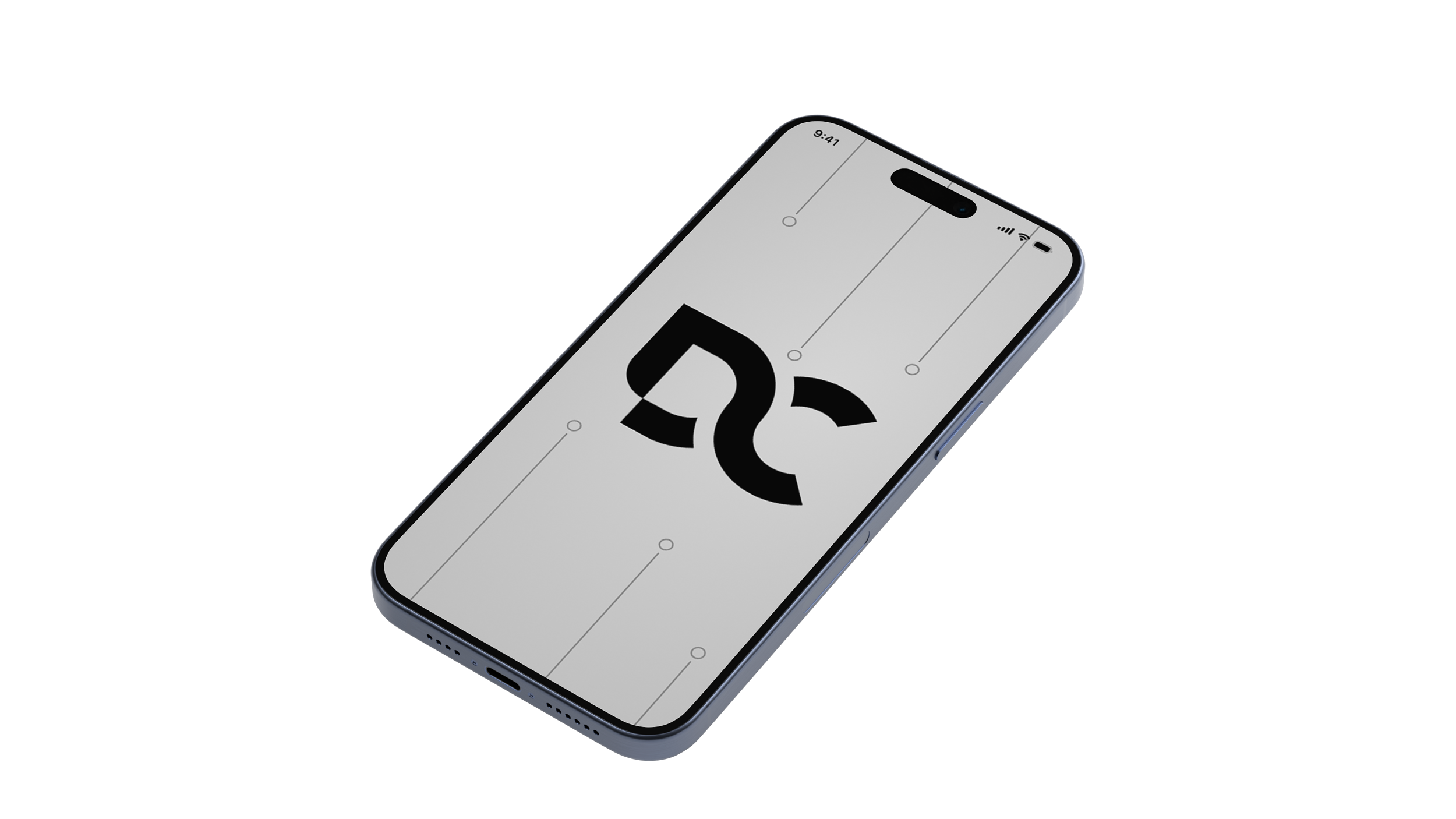
For the logo, I kept things very minimal. I wanted something clean, sharp, and easily recognisable even at small sizes.
As part of this assessment, we were also required to include at least one functional feature that extended beyond simply hosting news articles. For Disclosed, I wanted to give users a way to personalise their experience and quickly access the content most relevant to them. This led to the development of a customisable filtering system.
The filter allowed users to sort news articles by categories such as sport, crime, politics, culture, and more. By selecting the topics they were most interested in, users could tailor their feed to match their preferences, making the platform feel more curated and engaging.
In addition to developing the brand identity, I wanted to add something that would give the website more visual depth and personality. While researching, I came across several examples of websites that used layered scroll effects—where each new section smoothly slides or drags over the previous one as the user scrolls. I was really drawn to the sense of motion and dimension this created.
At the time, I was still very new to HTML and CSS, so recreating that effect was a real challenge. It involved a lot of trial and error, but eventually I managed to implement a version that worked and felt visually engaging. This layering effect added a dynamic feel to the site and helped reinforce Disclosed's modern and interactive design approach.