THE ISSUE
Toxcity in gaming is out of hand.
Guardian was a coding and branding project developed in response to the growing issue of toxicity in online gaming communities. As part of a summative brief, we were tasked with creating a “new enterprise” and building a corresponding website or app. Drawing from my own interests, I explored several problem areas before focusing on the widespread negativity in gaming environments.
Although video games are meant to be a source of entertainment and friendly competition, they've increasingly become associated with inappropriate and toxic behavior. While many developers have attempted to address this, their solutions often lack effectiveness and consistency. Guardian aimed to offer a more impactful solution; a platform powered by AI designed to detect toxic interactions in real time and either block them before they reach players or swiftly remove them from the environment.
Info
Toxcity in gaming is out of hand.

AI powered anti toxcity software.
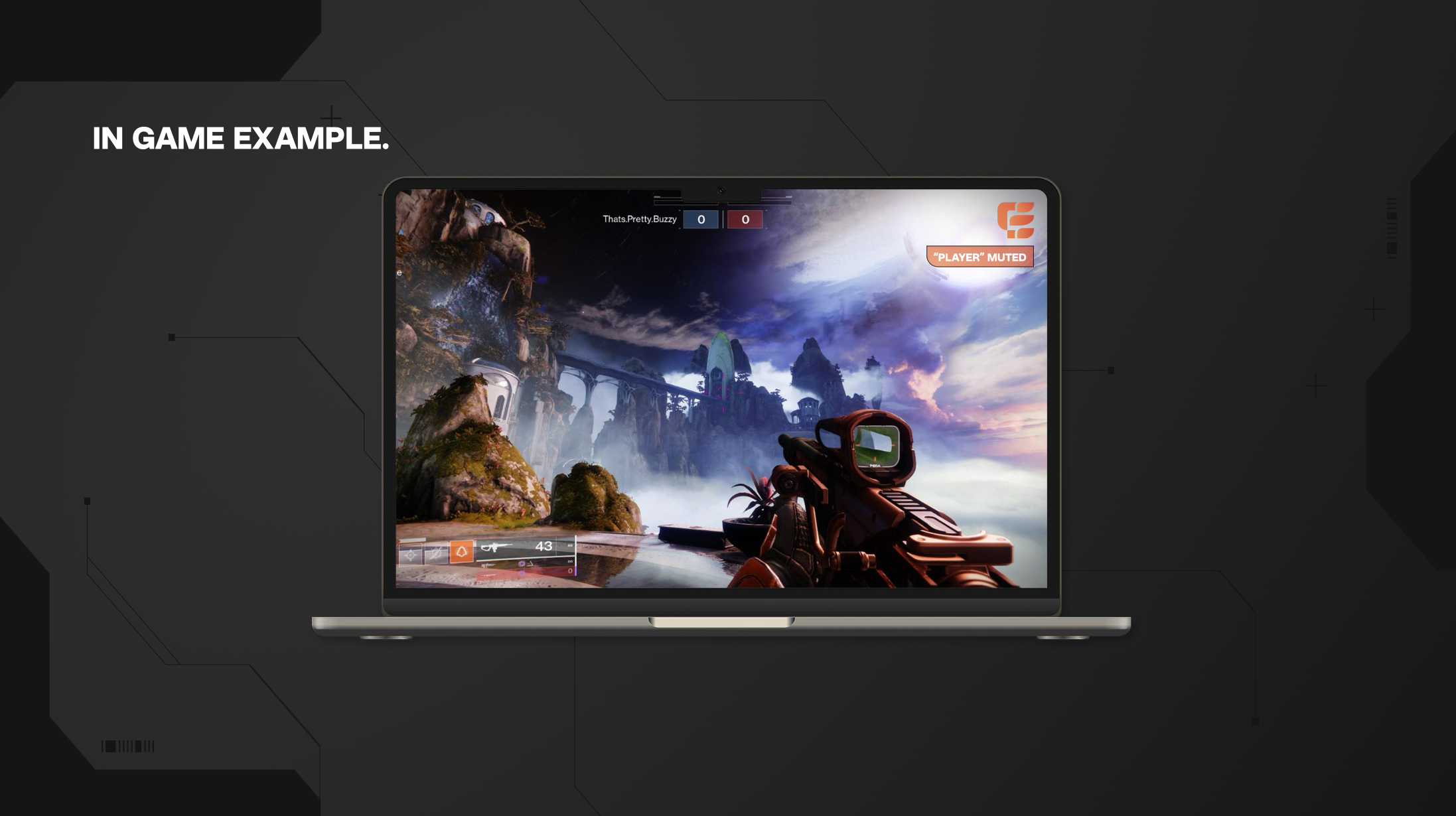
Guardian would function by giving users full control through a customizable settings menu. Players could decide exactly what kind of behavior they wanted to filter, whether that be offensive language, harassment, or other forms of toxic interaction and choose how they wanted Guardian to respond. Options could include automatically muting toxic players, reporting them, or filtering harmful content before it’s seen.
Once configured, Guardian would run quietly in the background during gameplay, acting only according to the user's preferences. It’s designed to be adaptive, non-intrusive, and supportive of a more positive gaming experience.
Guardian would also partner with game developers to ensure compatibility across a wide range of titles, helping to create safer gaming environments at scale.
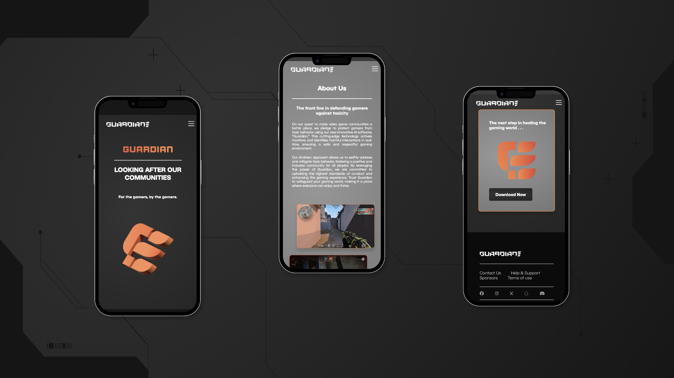
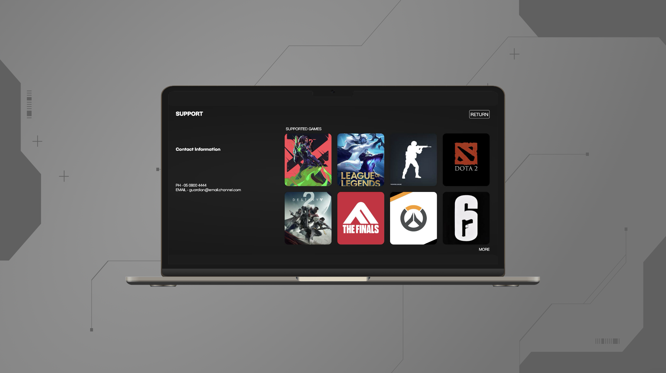
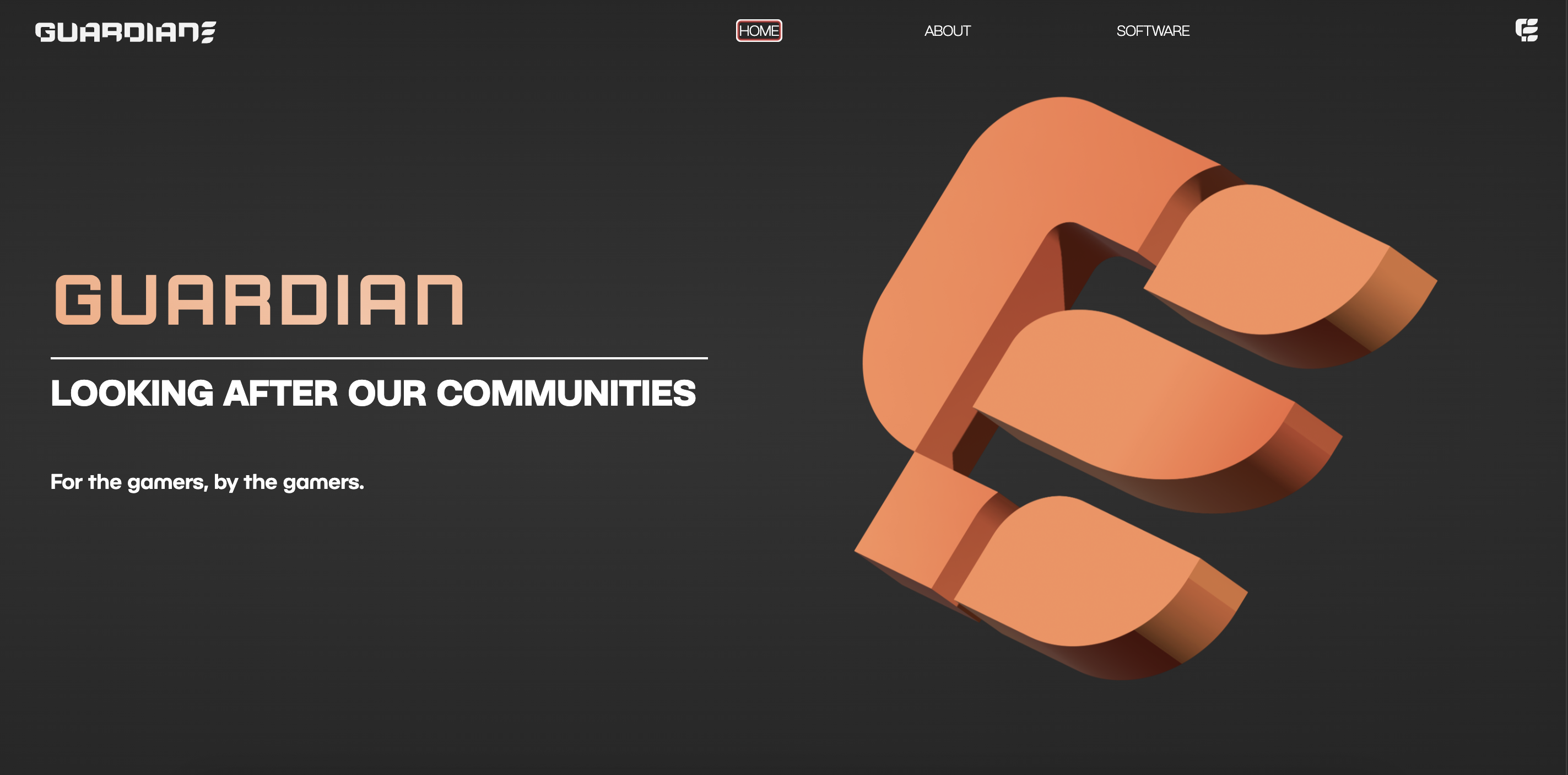
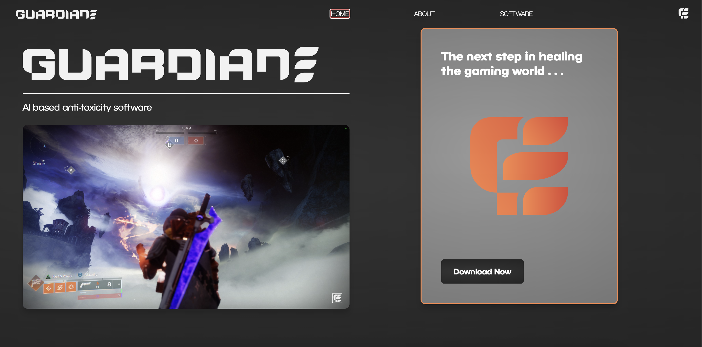
For the visual identity of Guardian, I wanted to create a look that would resonate broadly with the gaming community. Initially, I explored retro, Nintendo inspired aesthetics for the UI and branding. However, I ultimately shifted towards a more Cyberpunk 2077 inspired direction. The futuristic, tech driven nature of that style felt like a stronger match for the concept, reinforcing Guardian’s role as an advanced AI powered solution.
To bring this identity to life, I used sharp, jagged shapes and circuit board like design elements to evoke a sense of digital sophistication. The color palette combined slate greys and blacks with a striking orange accent, creating a sleek, high contrast aesthetic that felt both modern and assertive.
