Kupu Haerenga is a redesign & development for the upcoming launch of Kupu 3.0. Working with Spark NZ, we were tasked with enhancing the app’s experience and crafting a refined, future-focused evolution of an already powerful tool for learning te reo Māori.
TYPE
CLIENT
TOOLS
MY ROLE
LOCATION & DATE
LIVE BRIEF
SPARK NZ
ADOBE SUITE, FIGMA
UX UI, GRAPHIC
AUCKLAND 2025
MICHAEL DONG
JADE LUKE
MATT BROWN
MOTION, IllUSTRATION
MOTION, AUDIO
GRAPHIC, PROMOTIONAL
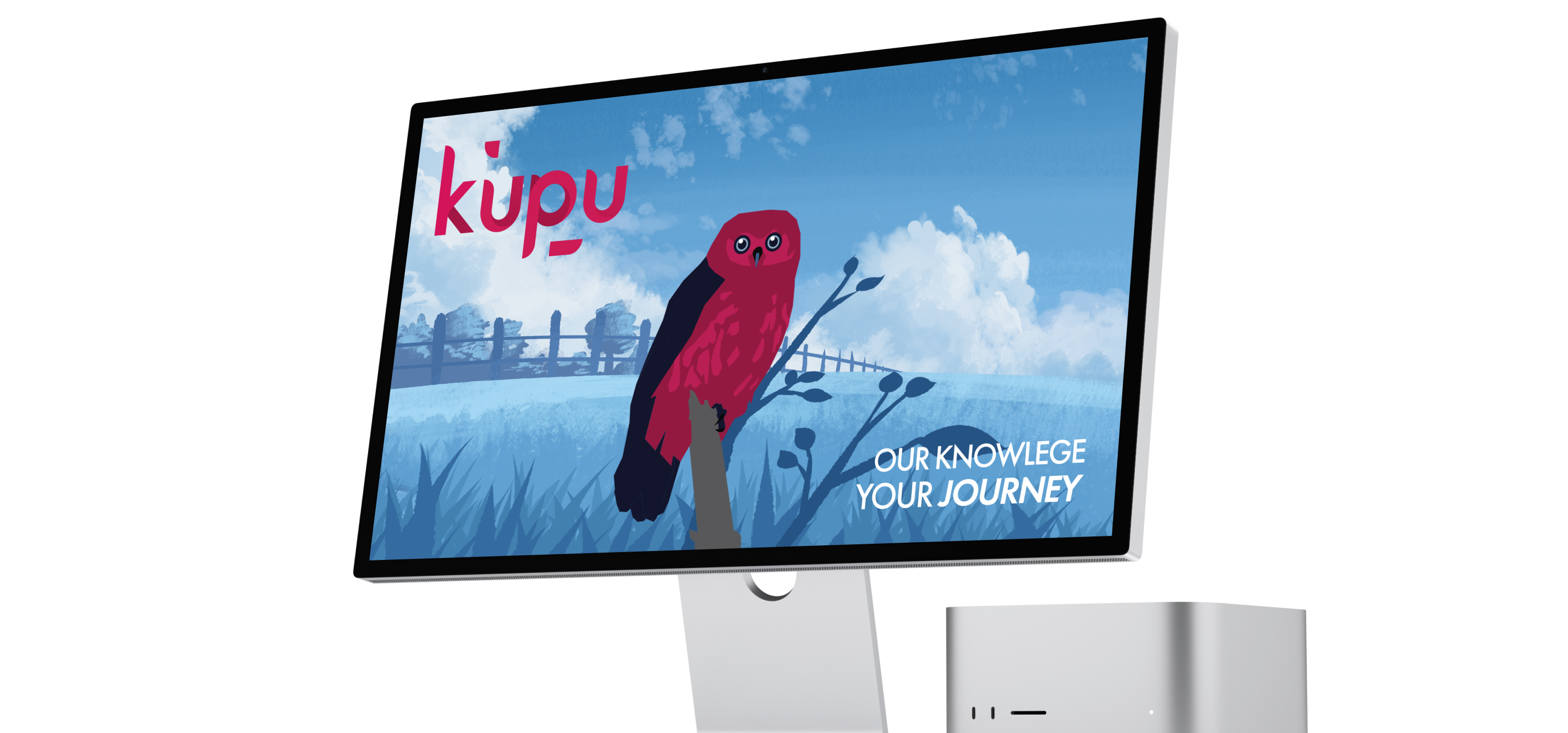
What is Kupu?
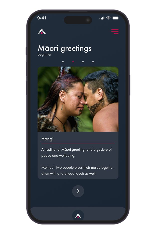
Kupu (meaning word) is a free mobile app that helps people learn te reo Māori by using a phone’s camera to identify objects and provide their Māori names. Developed by Spark and powered by Google technology, the app offers an interactive way to build vocabulary.
We were encouraged to think big and go as crazy as we
want, and after the inital briefing at Spark HQ, my team and I got
straight into it and began planning how we were going to approach
this brief.
We decided to focus on three main points:
Expanded Function
Updated Branding
Incentivise Learning
Our workflow was also based around three core stages, which we continuously revisited throughout the project. This approach ensured our process remained organised, flexible, and aligned with both project goals and user needs.
Ideation.
Regularly pitching ideas and collaborating as a team to uncover new creative approaches across the project.
Testing.
Constantly testing concepts and solutions to collect valuable feedback that informed and shaped our design decisions.
Refinement.
Implementing feedback and learnings to ensure outcomes we were confident and proud to deliver.
01 Expanding on Kupu
Early reserach showed that while Kupu is already a great tool
for learning Māori words in a very easy and simple way, it had
so much more potential. How could Kupu incentivise users to keep
using the app? How can we push the app up another level in terms
of its capacity for teaching te reo Māori?
The first solid idea that came to us from this sort of
questioning was Haerenga.
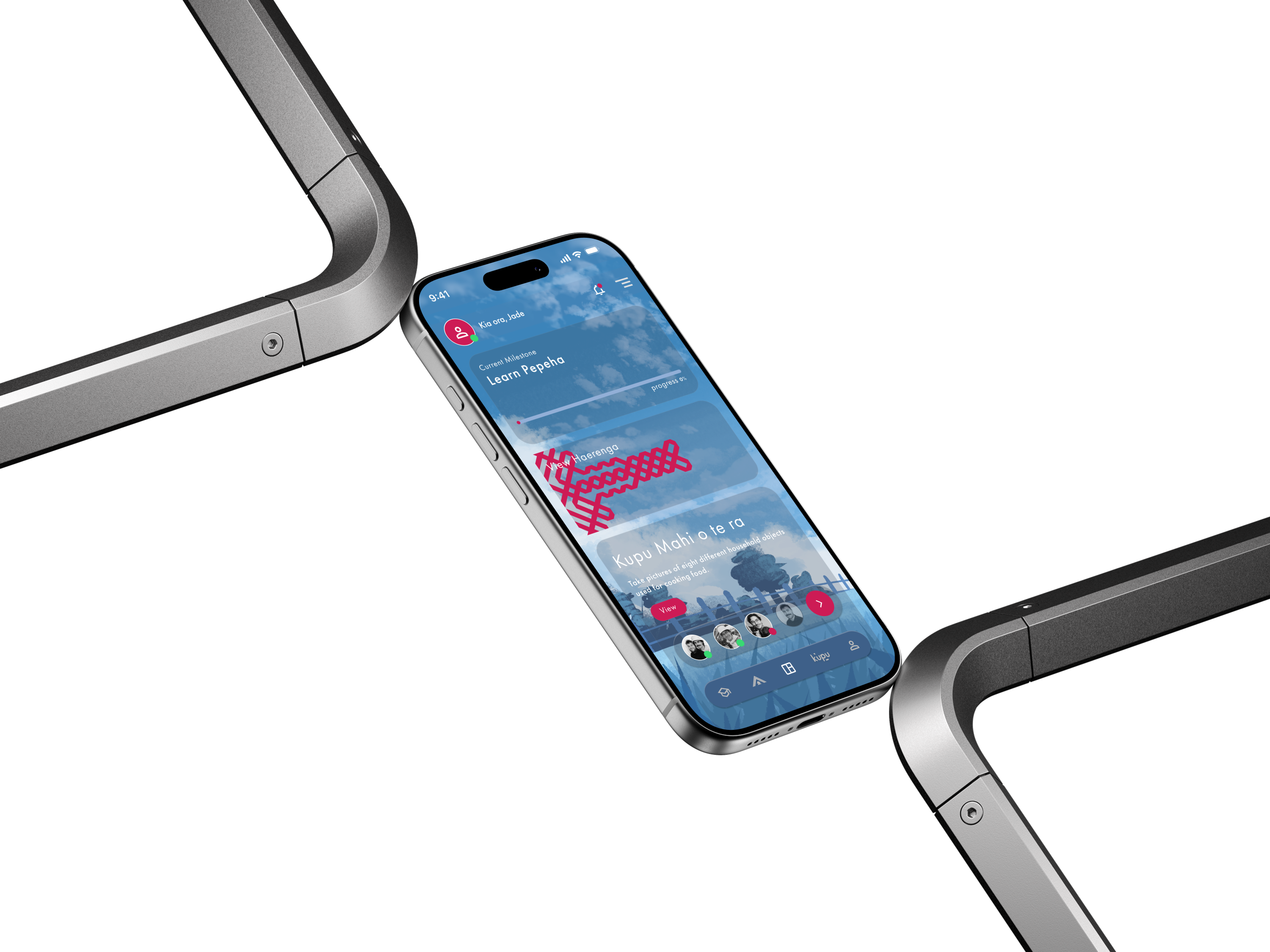
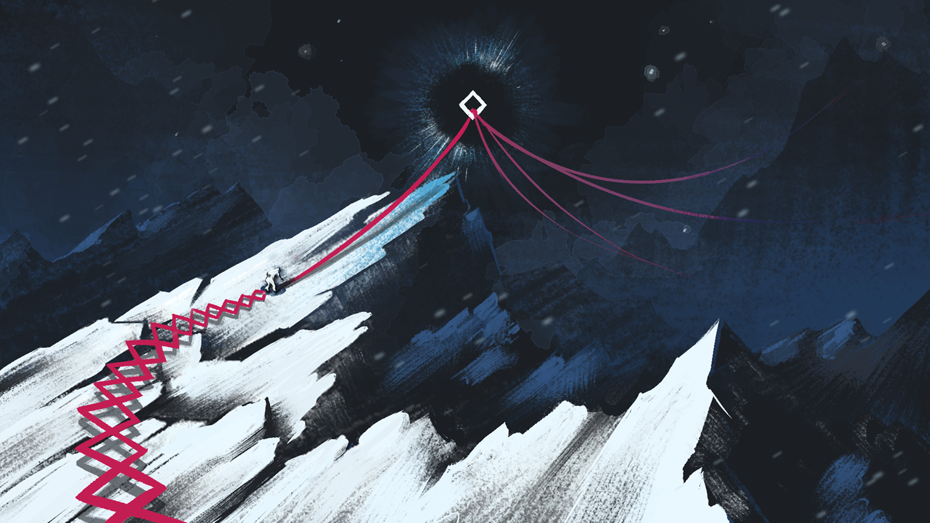
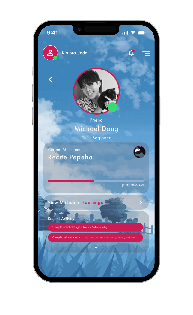
Haerenga, meaning journey in te reo, was an idea that came from
the thought that learning is a unique experience for everyone. We
all learn in different ways, and as such we each have a unique
haerenga that we must undertake to gain knowlege.
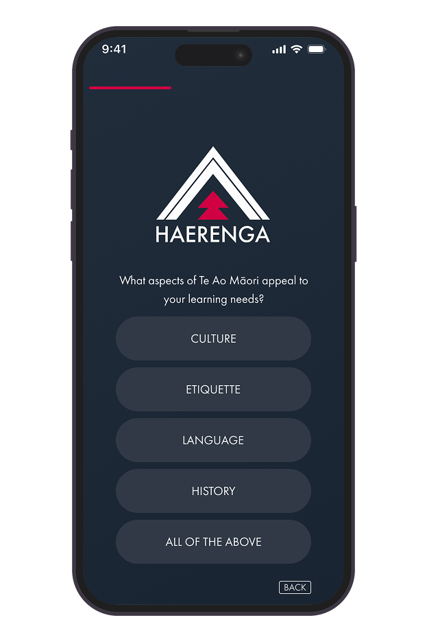
We brought this idea to life by creating a simple prototype where
a user would take a quiz to determine what type and level learner
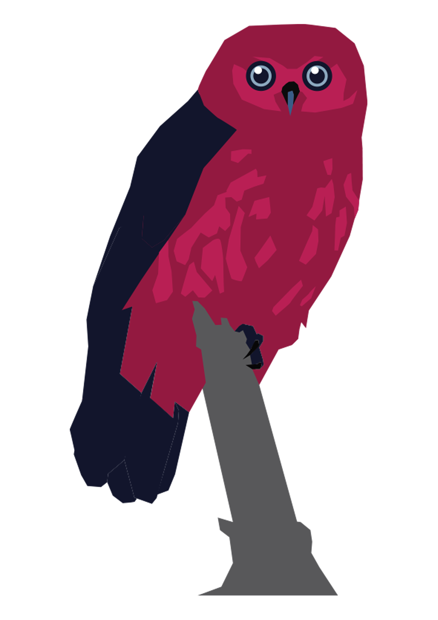
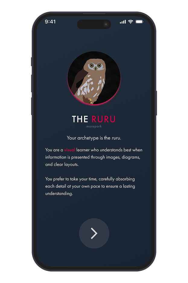
they are to get a custom experience. The quiz results would assign
them a learning guide in the form of a native bird, which would be
with them as they use the app. As a user progresses, they would
reach marked milestones that served as celebrations of their
journeys and challenges to complete.
Below shows a rough idea of how different users could be put on a
different path:
Users can still choose to learn anything they want, but this
catered experience will help people focus their learning based on
their specific needs. We Tested this prototype in the week heading
towards the first WIP presentation, where we gained vaulable
feedback from the client. The most notable being;
Expand on the existing kupu function as well, and the logo & name
has gone too far from the origional.
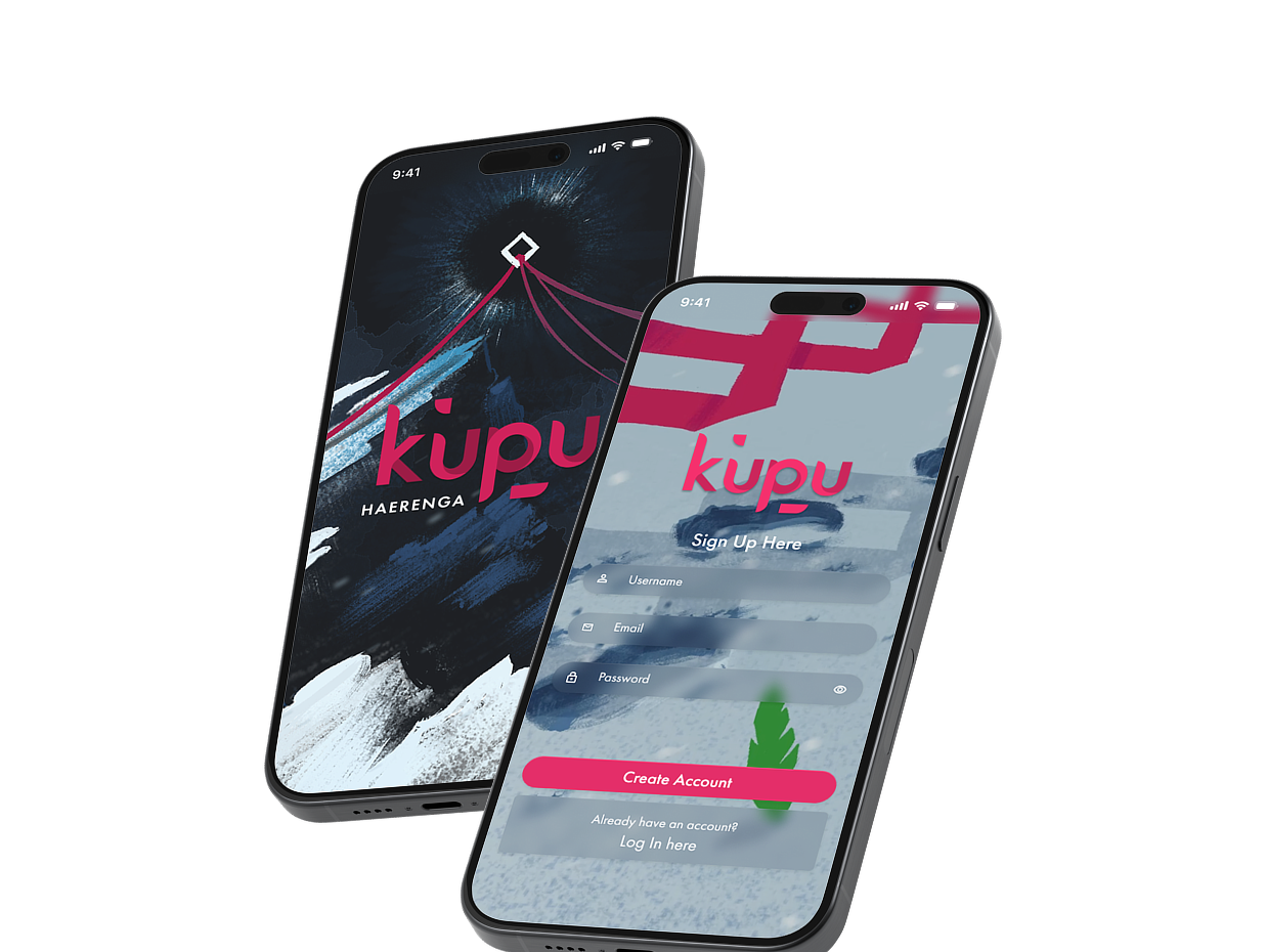
02 Kupu Branding
We knew going into the presentation that a full rebrand was
likely not the right direction, and we confirmed as much during
our talks with the client. However as far as our actual idea of
the Haerenga, the client loved it and let us know we had
something special there and to keep pushing.
Knowing we had a strong idea, we started looking further into
the visuals, especially raranga weaves. Raranga is a beautiful
Māori art form, and like the origional branding we wanted to
include it as a strong presence within Kupu's identity.

We experimented with ways the raranga could exist beyond a purely
visual or cultural element. We asked whether it could be directly
tied to the concept and function of the haerenga.
It quickly became clear that the raranga itself could act as the
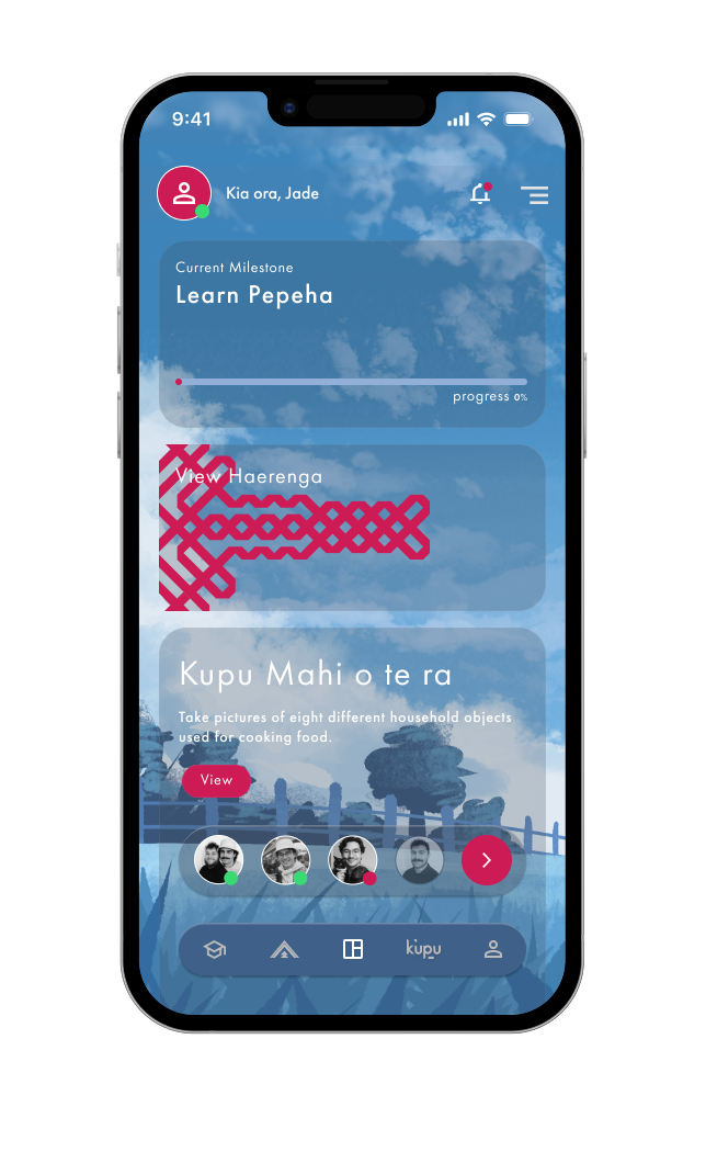
physical embodiment of the learning journey.
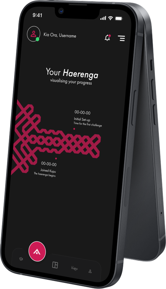
As users progress through their learning journey, a personalised
tracker in the form of a raranga weave gradually grows and
evolves. This serves as a visual representation of their overall
progress and key milestones, accessible from the dashboard.
Testing this concept revealed strong engagement with the idea of
visualising progress and achievement. This feature became an
important bridge between our visual design direction and the app’s
core learning experience.
The next problem I had to tackle was the staple of our branding; the logo. Now that I knew to keep much closer to the origional branding I revisted the current logo and considered how it could be improved.
To maintain a familiar visual connection with the existing logo, I
used the same typeface (Futura PT) as the foundation for my
redesign and began by sketching initial concepts. My goal was to
push the current logo in a more modern and refined direction while
still preserving its core identity.
The design that became “the one” began as an exploration of how
Māori koru forms could be incorporated into the logo. I focused on
translating the sharp curvature of koru art into a contemporary
visual style, using soft gradients and separating the letterforms
into two distinct shapes. This approach created a sense of depth
and helped achieve the refined, modern look I was aiming for.
Feedback on the final logo was overwhelmingly positive, from fellow team members, designers, and the client. I’m particularly proud of this outcome, as the logo works effectively as a standalone asset while also integrating seamlessly into the overall visual identity.

As part of this project the motion team also worked on animiated promotional material where a combination of vector & hand drawn illustration was used. After our second WIP meeting, the idea was raised that the illustrated backgrounds could be also be used with the app itself. I then took the time to see how this could look as part of the user interface, and was pleased with the results.
03 App Refinement
With a solid foundation and the branding in place, the focus shifted to refining the app and identifying opportunities to further incentivise continued use. Although the personalised learning experience was already effective, we aimed to extend its impact, especially through enhancing the Kupu camera function.
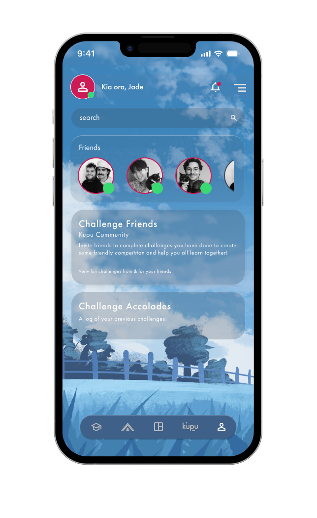
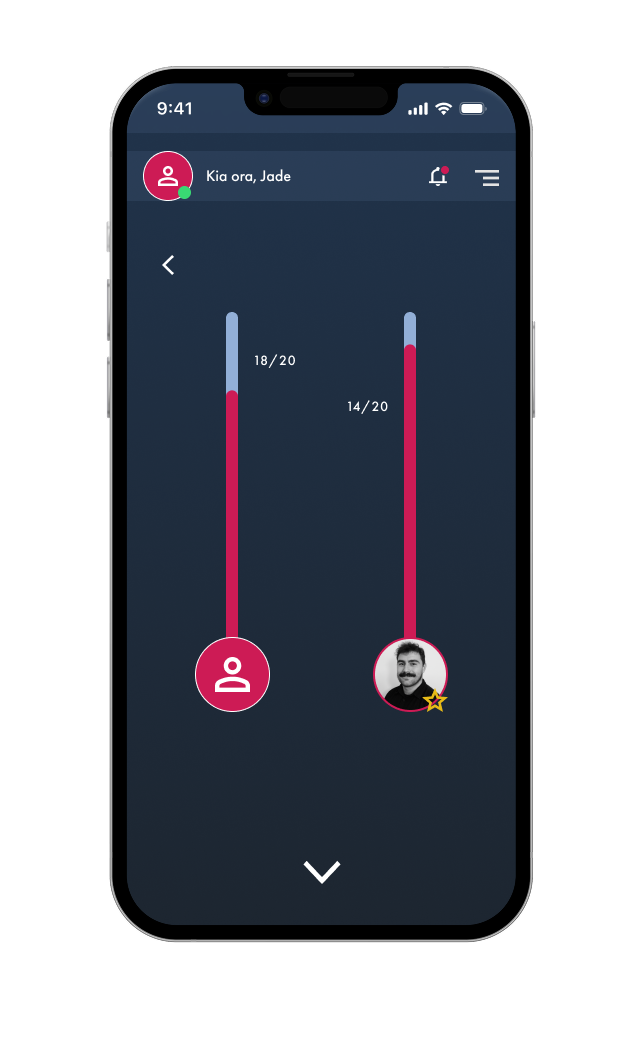
We found the incentive we were looking for in competition.
Research showed that one of the most effective ways to motivate
users is by creating a sense of friendly rivalry. With this in
mind, we designed a community system where users can connect, add
friends, and challenge each other through features such as
learning speed quizzes.
The client was especially fond of this concept, noting that it
aligned closely with the type of incentive they had been hoping to
explore.