Made You Look
Group Project - Overview
Born and raised in Aotearoa, Made You Look is an emerging musical duo poised to make their mark. Drawing inspiration from artists like Twenty One Pilots and Imagine Dragons, the band brings a bold, genre-blending sound to their soon to be released debut album. Our brief was to develop a full launch campaign that would introduce Made You Look to the world.
This included designing and producing a website, a merchandise line, and a range of promotional materials to build anticipation and connect with their target audience.
Roles
- UX Design
- UI Design
- Prototyping
- Logo Design
- Typography
- User Testing
- Developing
Team
- Graphic
- Dani Gaensicke
- Graphic
- Nikhil Narayan
- Motion
- Amanda Johnson
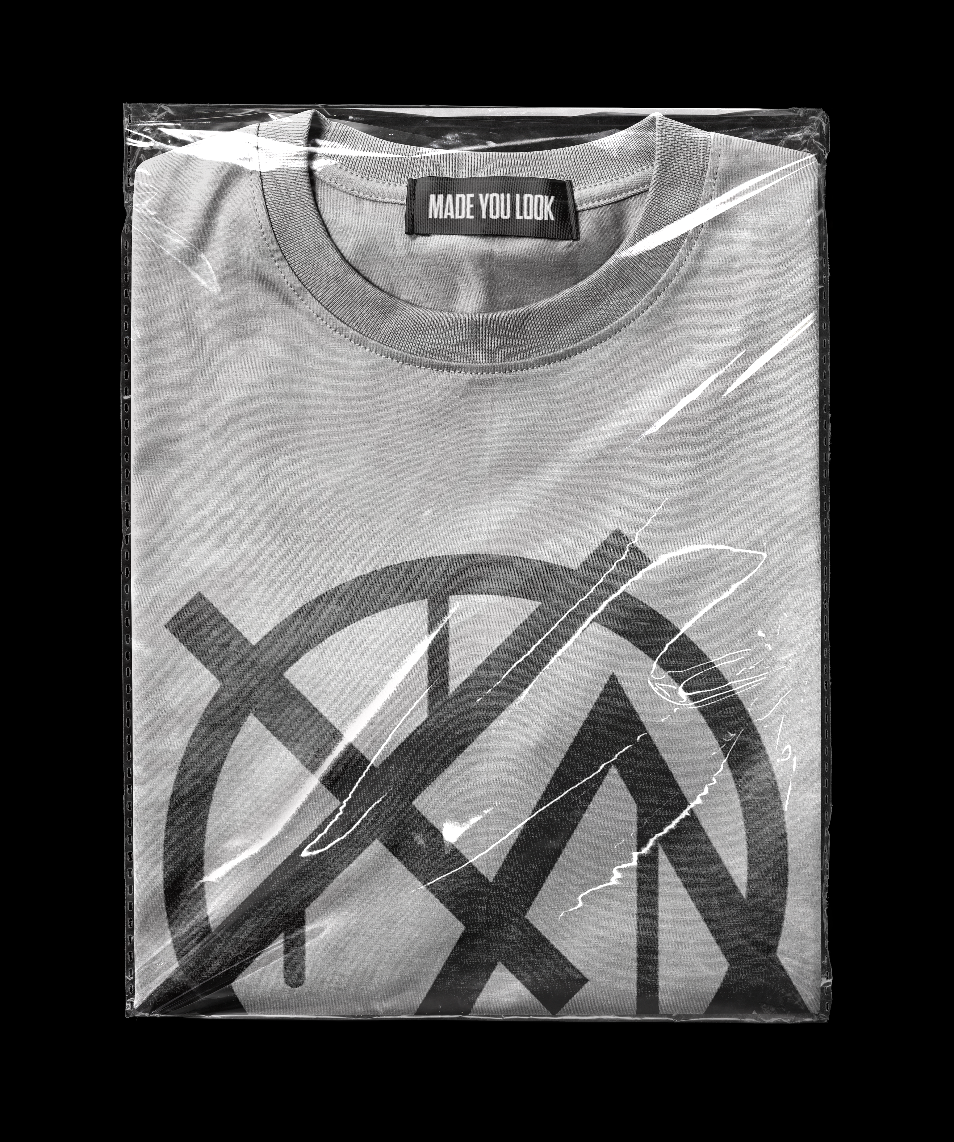
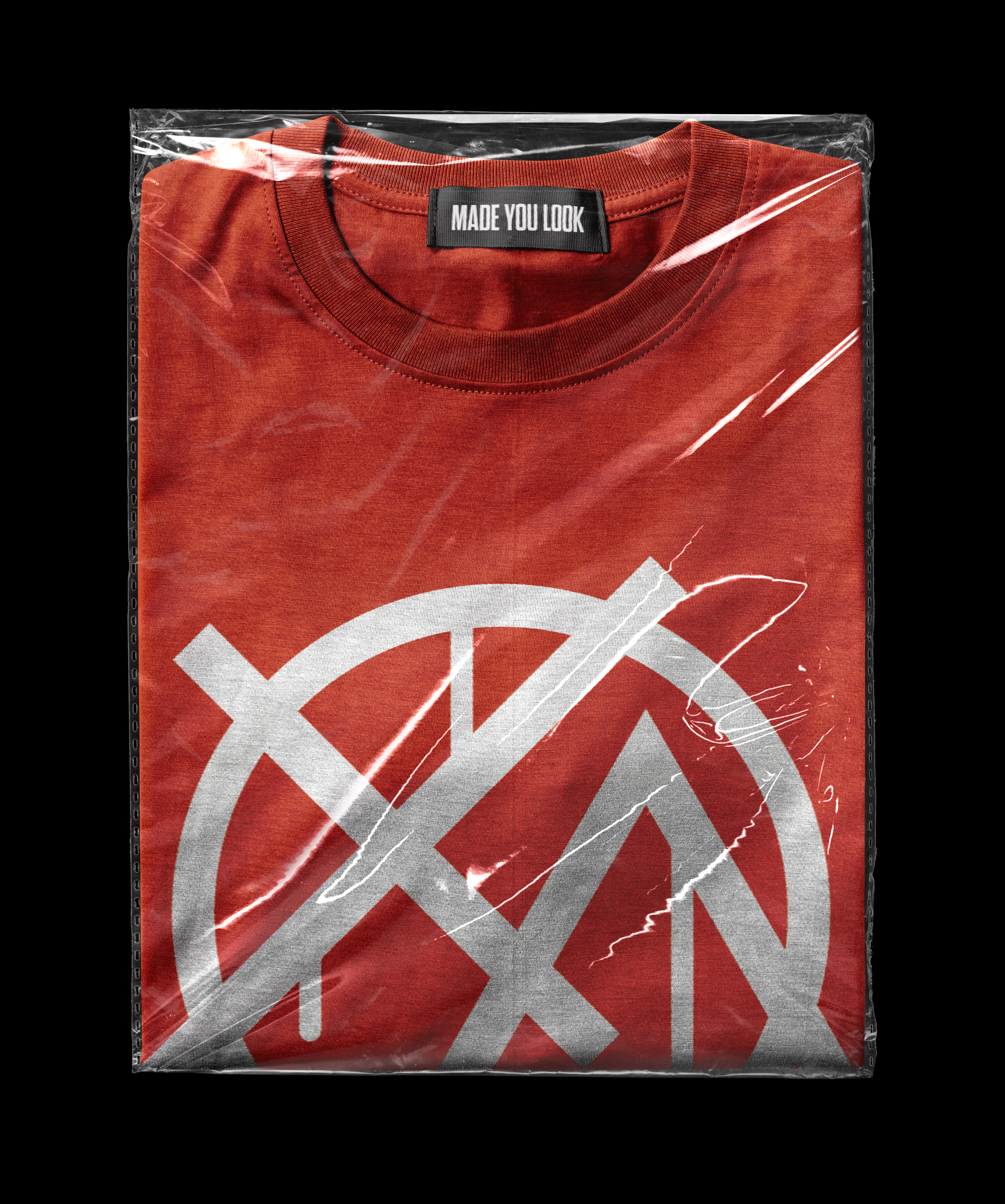
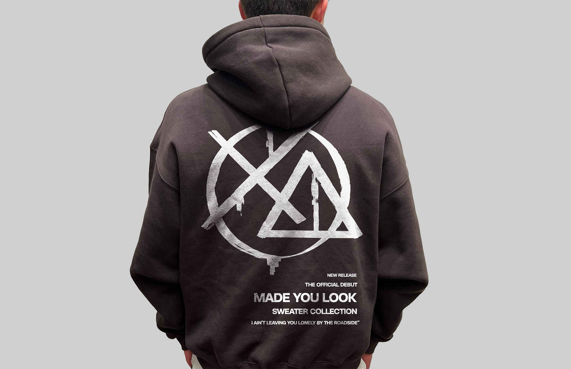
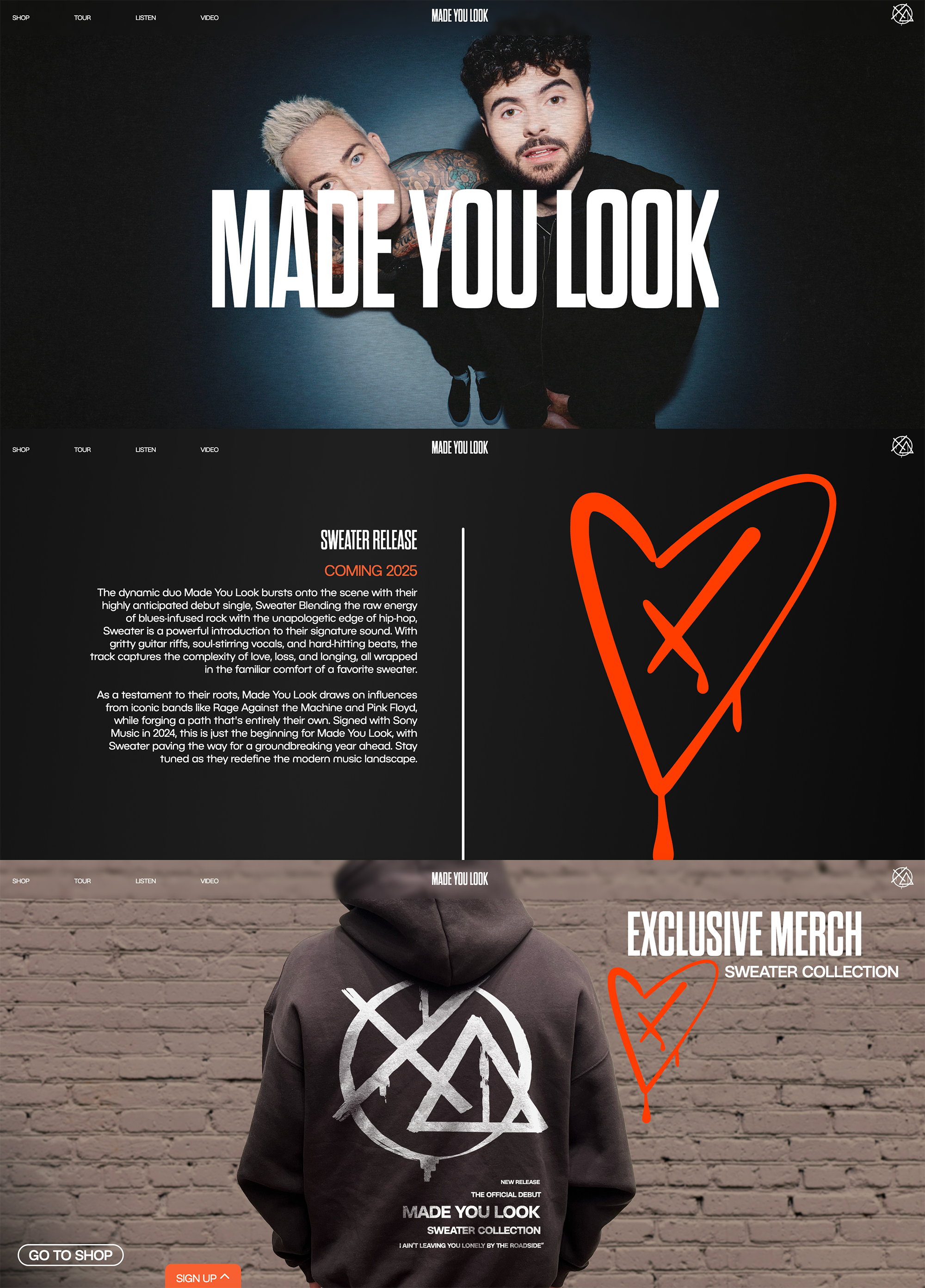
LOGO DESIGN
Although my primary role in the team was as the UX/UI designer, one of my earliest contributions to the project was the creation of our logo. Drawing inspiration from skate culture and the bold, expressive nature of graffiti art, the "Made You Look" logo was designed to strike a harmonious balance between the two and create a strong visual impact.
The logo is more than just a visual mark, it represents the two members of the band and tells the story of how they first met.
Alex and Shelton first crossed paths in an informal boxing match, walking away with physical injuries and a strong connection. The x and triangle symbolize Alex’s broken nose and Shelton’s black eye, while the circle represents the ring they fought in. Together, these shapes form a visual metaphor for their origins and the raw energy of Made You Look.
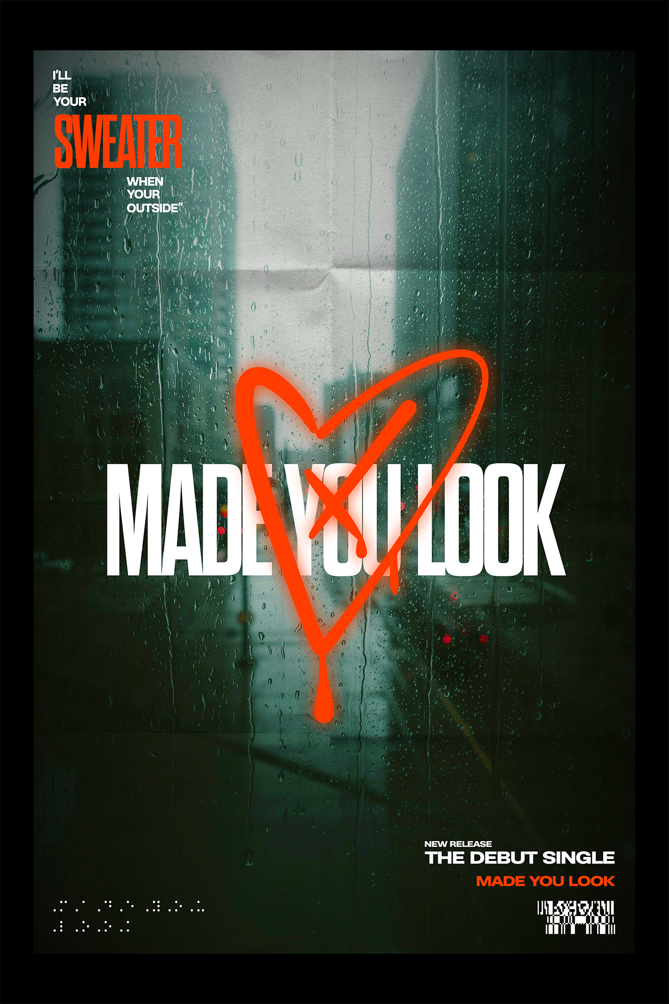
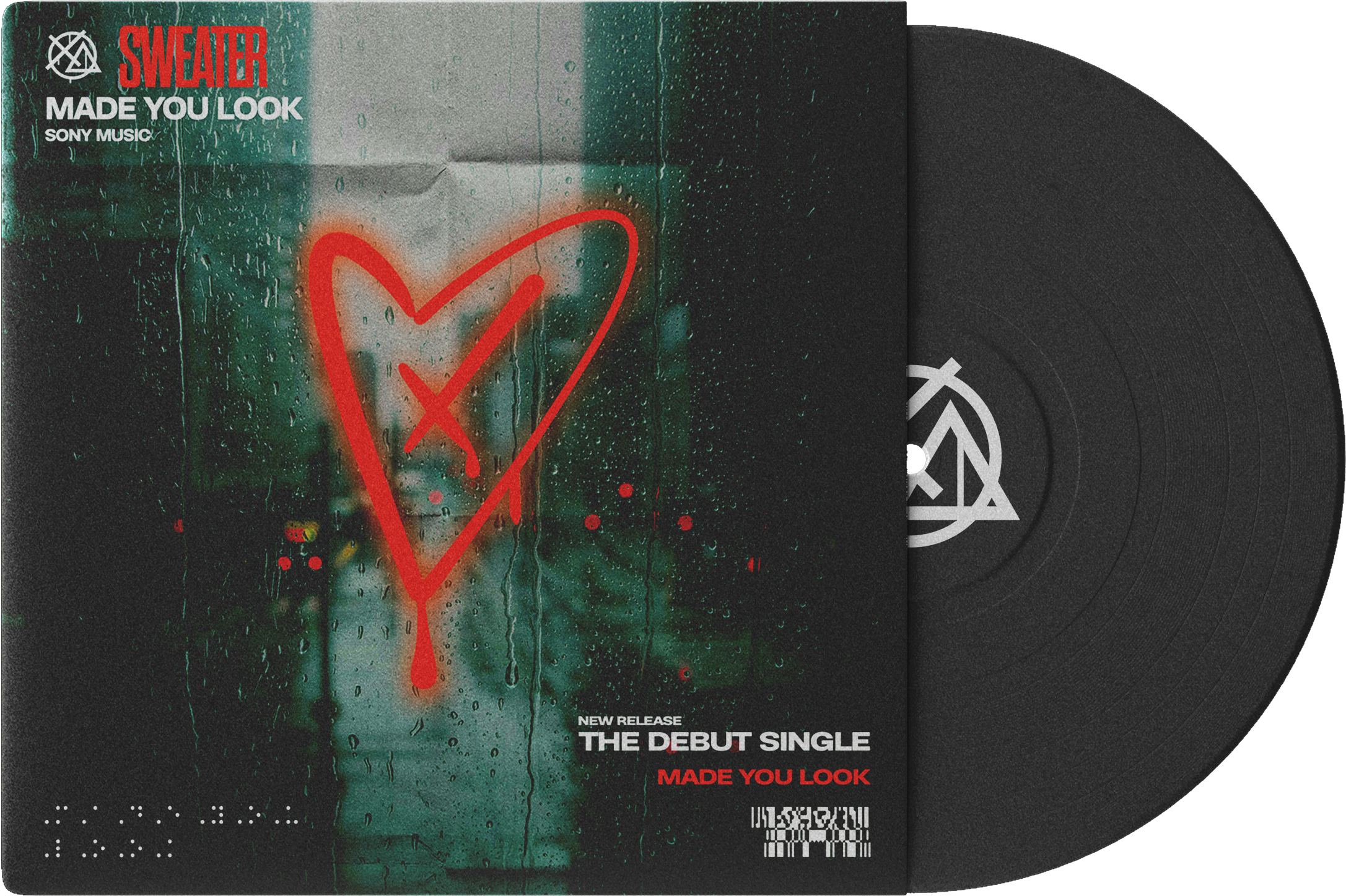
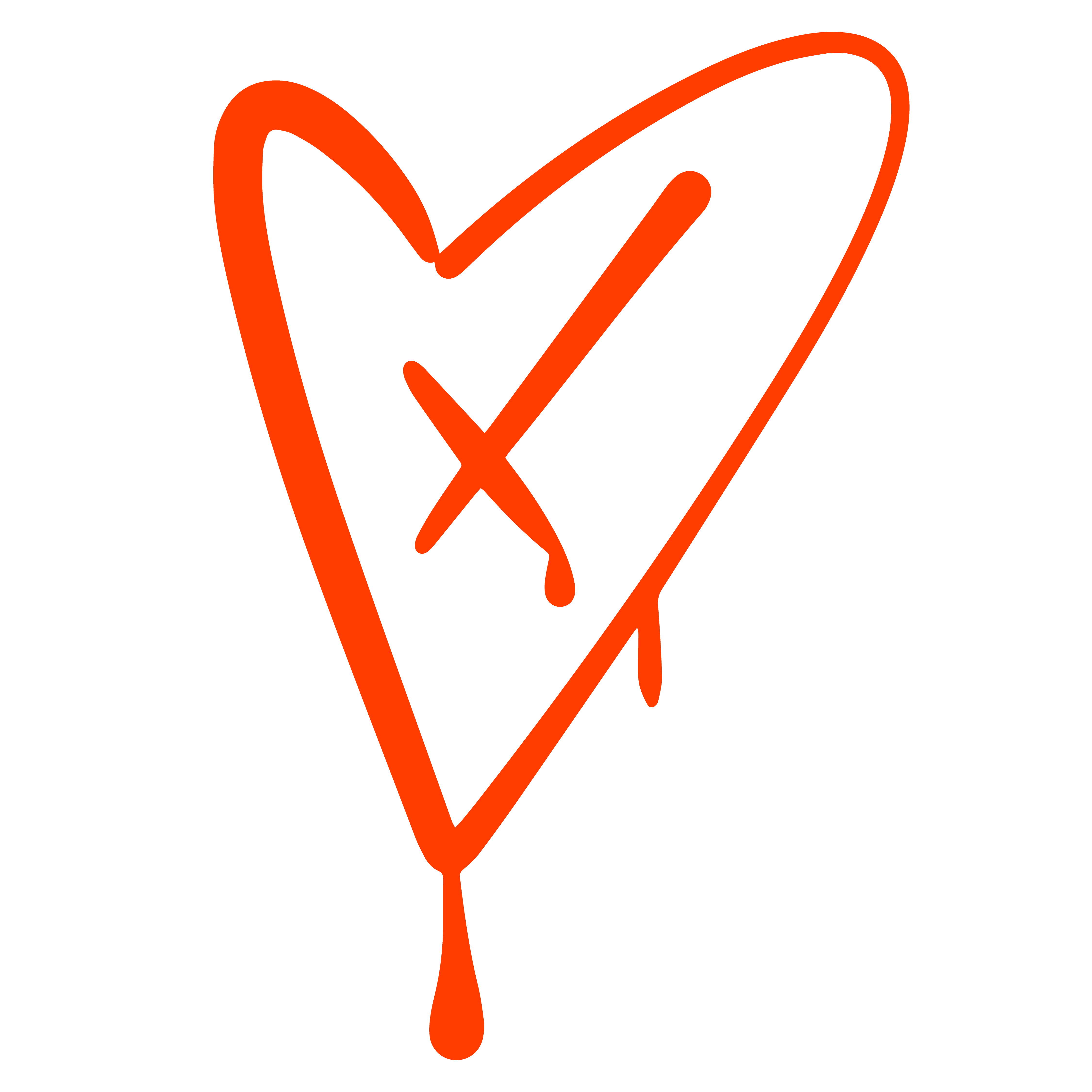
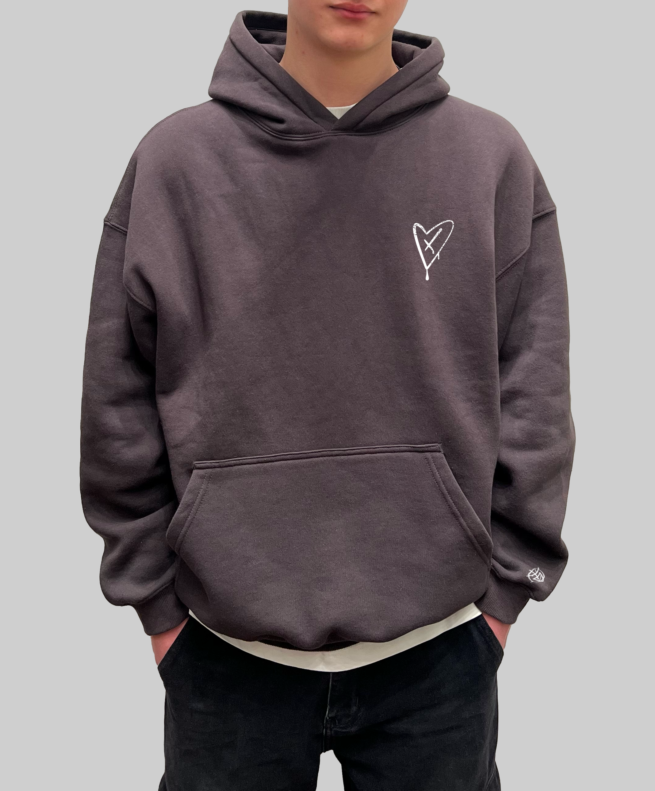
Along with a general logo for the band, I also created a more specific design for the release of their debut single, "Sweater." Following the song's themes of relationships and heartbreak, and trying to remain consistent with the existing branding and logo, I created this heart vector.
Using the same method as before, the x represents injury or damage implying heartbreak. I also maintained the same spray paint effect.
This secondary logo was intended for use on any colateral directly associated with the release of Sweater.
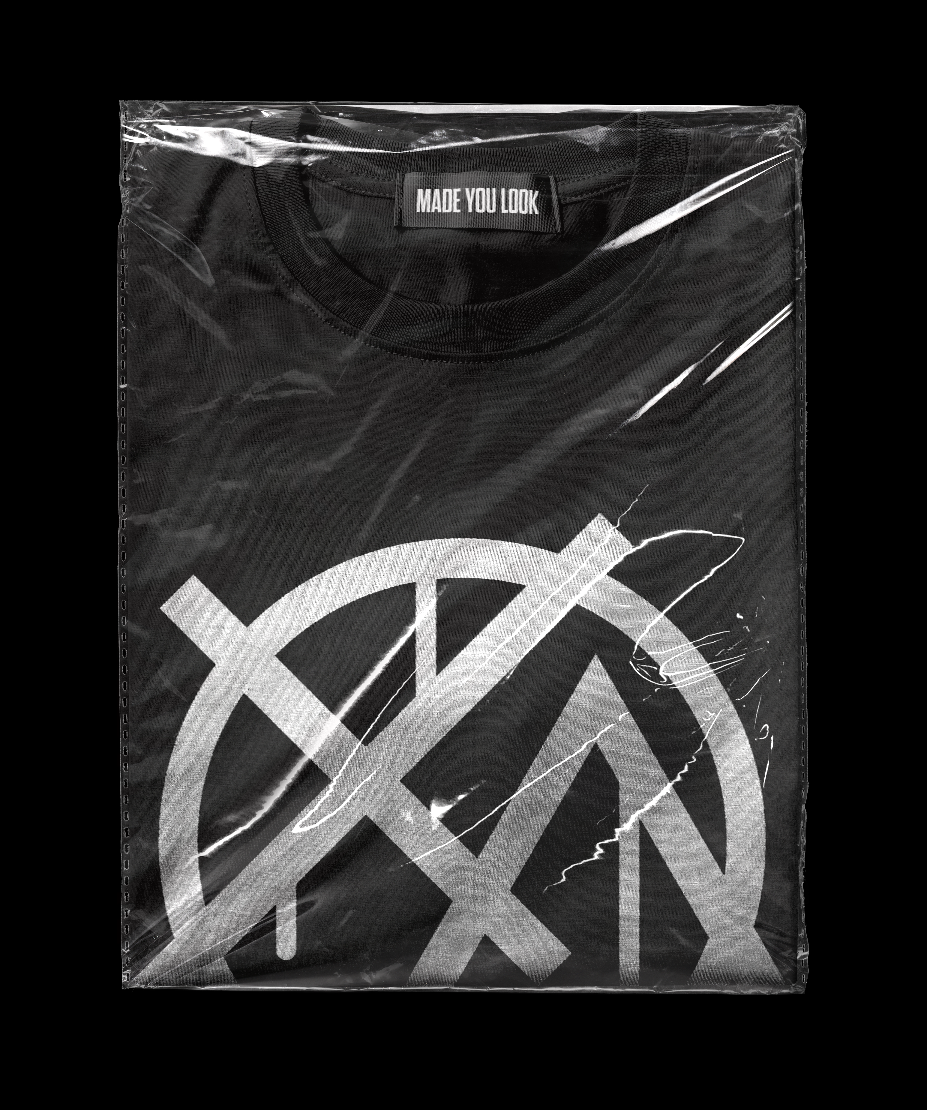
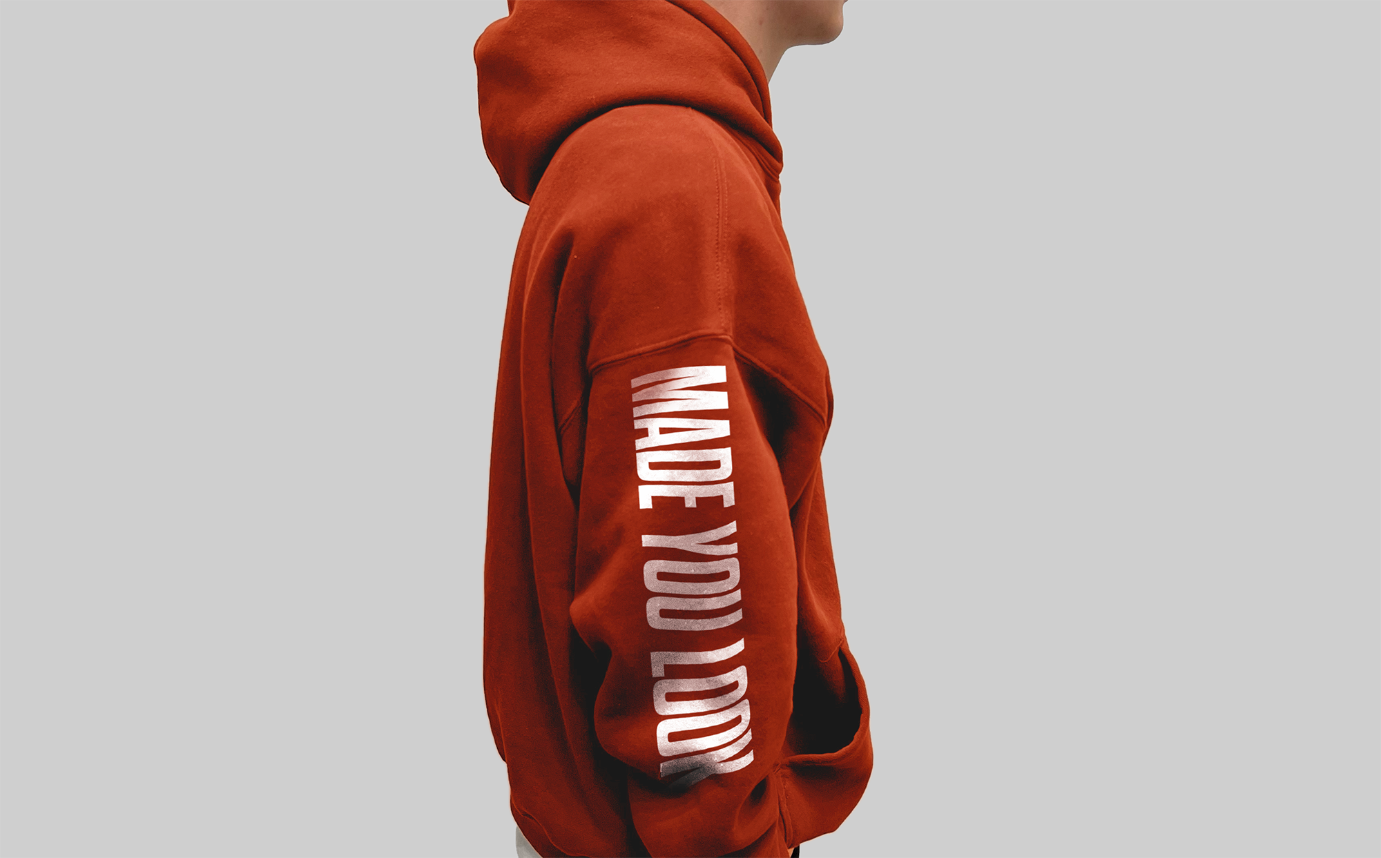
MERCHANDISE
Designing the merchandise was one of the most rewarding parts of the project. I particularly enjoyed experimenting with hoodie and sweater concepts, exploring how we could incorporate the project’s visual identity into wearable pieces that felt authentic and bold.
While we considered several merchandise directions early on, our research and our own lived experience revealed that clothing resonated most strongly with our target audience of young adults. With that insight, we focused on hoodies and t-shirts.
WEBSITE DESIGN
Designing and developing the Made You Look website was an exciting opportunity to deepen my coding skills and explore new visual techniques. Reflecting on the initial client briefing, two key themes stood out from the band members: they were passionate about sharing their story in a meaningful way, and they were eager to launch a custom merchandise line in tandem with their debut single, Sweater.
With those goals in mind, I began building a site that would feel both personal and promotional something that truly reflected the identity of the band. Just below the landing page, I incorporated an interactive storytelling section that introduces visitors to each band member and recounts how they came together to form Made You Look. This feature aimed to create a sense of connection between the band and their audience.
The site also includes a dedicated merchandise section where fans can explore and purchase items from the debut collection. The final product is a clean platform that delivers on both storytelling and brand building aligned with the band’s aspirations and creative direction.
CAMPAIGN COLLATERAL
As the project neared completion, I was needed to support the development of key visual assets. With the final submission deadline approaching, our goal was to consolidate as much campaign collateral as possible to present a cohesive and impactful brand.
One of my final contributions was the design of a multi purpose visual that would serve as a single cover, social media post, and promotional poster. In keeping with the visual language we had developed throughout the project, this piece incorporated layered subtext and subtle graphic elements to maintain consistency and depth. The use of a rainy backdrop was a deliberate choice, intended to reflect the emotional tone of the debut single Sweater and visually communicate its theme of heartbreak.